
Exit-Intent Strategies that Turn Abandoning Visitors into Buyers

Photo: Freepik.com, rawpixel.com
Most visitors won’t convert on their first visit and many leave just seconds before they are about to act. That moment of exit is expensive. It’s the lost cost of traffic, the wasted effort of getting them there, and the missed chance to connect.
Exit-intent popups exist for that narrow window between decision and departure. The key isn’t flashy design or loud messaging. It’s timing. Knowing when someone is about to leave is more powerful than anything you say once they’re gone. In this blog post, we’ll explore strategies that turn popups into an effective tool for achieving your marketing goals.
Why Visitors Abandon in the First Place
Most exits don’t happen because someone decided not to buy. They happen because the moment didn’t feel right. Maybe the final price spiked when shipping fees showed up. Maybe the checkout felt like paperwork. Maybe they weren’t sure if they needed it right now.
What’s important is that not every exit is a hard “no.” Many are undecided, distracted, or planning to “come back later”. These users are still in play. With the right message you can catch that slip and turn it into a conversion.
The Psychology Behind Exit-Intent Popups
Sometimes people leave because something feels unresolved. At the point of exit, users are mentally shifting from consideration to abandonment. But their decision isn’t always final. It’s often interrupted, incomplete, or full of hesitation. That’s where psychology steps in.
FOMO (fear of missing out) kicks in when we sense we’re about to lose a deal, a perk, or an opportunity others might grab. Loss aversion makes the idea of “missing” something feel worse than never having it at all. And decision friction—that little moment of doubt—grows stronger as the brain tries to protect itself from making the wrong choice.
A timely exit popup reduces uncertainty. It gives a reason to pause, not just leave. It reframes exit as a decision point, not a done deal.
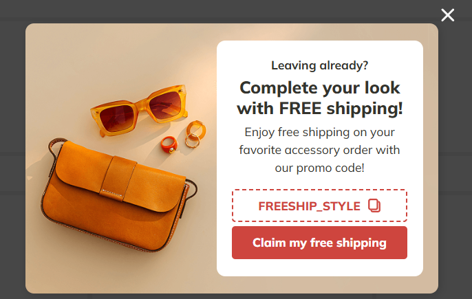
Popup example from Claspo’s template library
When you offer clarity, reassurance, or urgency at that precise moment, you’re helping the brain complete what it started.
What Makes an Exit-Intent Popup Convert
Conversion doesn’t happen because a popup appears. It happens because it appears at the right moment with the right message for the right person. Most exit popups fail because they’re built as interruptions, not decisions.
Timing matters most. Exit-intent should trigger when someone’s behavior clearly signals they’re leaving—not when they’ve just landed, not mid-scroll. If your popup feels like a surprise party thrown in the wrong room, it’s already lost.
Clarity is non-negotiable. One message, one action. Don’t throw a discount, a sign-up form, and three logos into the same box. The more you ask, the less users do.
Relevance is where conversion actually happens. A cart abandoner doesn’t want your newsletter. A blog reader doesn’t need 10% off a product they haven’t seen. The message must match the user's intent at that moment.
And finally, trust. If you’re offering value, back it up. Show real reviews, include a money-back guarantee, or simply use honest, human copy. At exit, trust is fragile. Don't make users guess if your offer is real or risky.
Segment and Personalize for Context
A generic popup is easy to ignore because it wasn’t meant for anyone in particular. If you want your exit-intent strategy to work, it has to feel like it was built for this visitor, at this moment.
Not every user is on the same path. A first-time browser and a cart abandoner have different priorities. One needs a reason to stay curious, the other needs a reason to commit. So why show them the same message?
Start with basic segmentation:
- First-time visitor? Offer a lead magnet, free resource, or welcome incentive.
- Cart abandoner? Address hesitation with a discount or free shipping.
- Returning visitor? Resurface a previously viewed product or highlight a time-sensitive offer.
Then layer in behavioral context:
- Which page did they visit?
- How long did they stay?
- How far did they scroll?
- Did they add items to the cart?
These signals help you move from “here’s a popup” to “here’s what you might need right now.” Context is what makes an exit-intent popup feel relevant rather than random. And relevance, not reach, is what drives conversions.
If you’re looking for a tool that makes this kind of relevance easier to execute, Claspo is worth a look. It lets you target users based on behavior, device, traffic source, and more without overcomplicating the setup. The built-in template library is actually usable: clean, fast-loading, and built for real goals, not just looks.
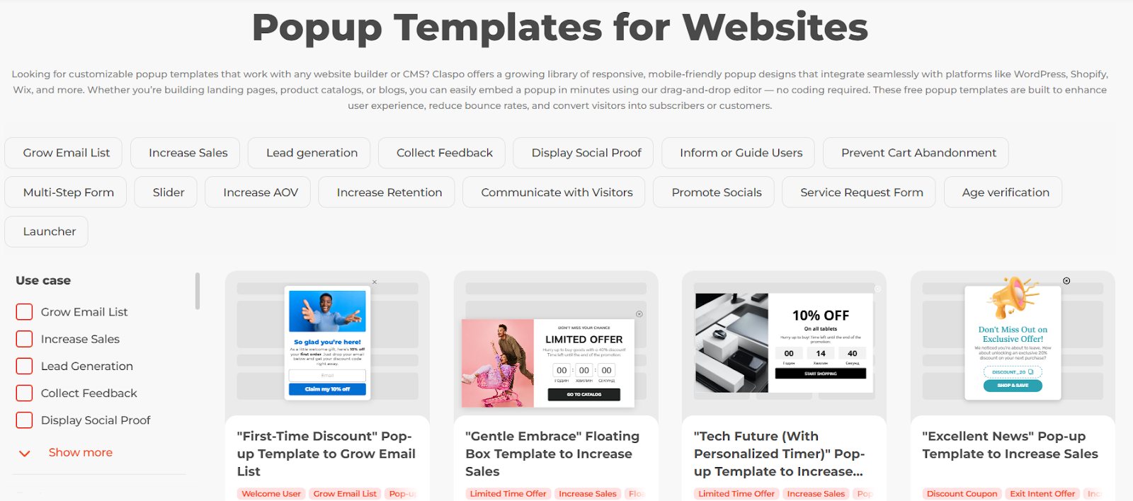
Claspo’s templates library
You can find real exit-intent popup examples to inspire your strategies at the link.
A/B Testing: Don’t Guess, Test
What feels like a “good” popup in theory might tank in practice and vice versa. That’s why testing isn’t optional. It helps you move to actual results.
Test one variable at a time:
- Does a question in the headline perform better than a statement?
- Does urgency convert more than reassurance?
- Does a 10% discount work better than free shipping?
Sometimes the smallest change like a shorter CTA, a simpler layout, a different tone makes the biggest difference. But you won’t know unless you test.
Treat your popups like a product. Improve them the same way you would improve onboarding, UX, or ad performance based on data. Tools like Claspo let you run controlled tests and track what’s actually moving the needle.
Common Mistakes to Avoid
Exit popups can either win back hesitant visitors or quietly erode trust. The difference usually comes down to how and how often they’re used.
Too many popups mean user fatigue. If someone closes three different overlays before they even scroll, they’re not going to stick around for a fourth. Even the most well-crafted message falls flat if it appears too early or too often.
Aggressive or manipulative copy backfires. “Wait! Don’t go!” isn’t persuasive. It’s needy. And fake scarcity (“only 1 left!” when there’s clearly more) teaches users not to believe you. Urgency works, but only when it’s real.
Generic offers feel lazy. A random 10% off might look helpful, but if it doesn’t connect to what the user was doing, it falls flat. Offers should reflect intent: the page they were on, the product they added, the stage they’re in.
And don’t forget mobile. Many exit popups are designed for desktop and simply shrink on smaller screens often breaking or annoying users. If your mobile experience feels like a fight, users will choose the easier option: leaving.


